This is a sample page meant to provide a brief overview on how to structure your site in WordPress and to show some theme-specific information. For a more comprehensive list of sample content that includes standard WordPress blocks please view the ‘Content Samples’ page. Neither are meant to be a fully comprehensive guide to web development or building content within a CMS, but clicking through these pages to see how blocks were used may be helpful while getting started.
Parent/Child Relationships
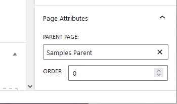
This page is a child of the “Samples Parent” page. You create this relationship on the child page by assigning a parent page in the page properties on the right-hand side. You may have to scroll down to see this option. You can also specify an order of child pages here (starting at 0 for the first item) if needed.
Page Templates
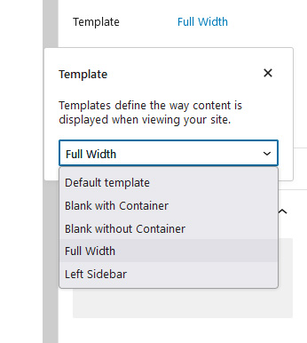
There are several page templates included in this theme available for you to use. Simply click the “Template” option in the page properties to the right to select the one you would like to use. The options are:
- Default (Has a sidebar on the right side)
- Blank with Container
- Blank without Container
- Full Width
- Left Sidebar
This page uses the default template which includes the navigation sidebar on the right-hand side of the main content container. This navigation sidebar is built to be responsive; on smaller mobile displays it will automatically hide itself so as not to overwhelm the available screen space for main content.
Of these five options, you will almost always be using either default or full width. As noted, the default template has a sidebar on the right-side of the page for desktop views. The full width template never has a sidebar, the content will stretch to fill the entire container it’s in. Note that this does not mean content will stretch from edge-to-edge of the browser, as the content area width maxes out at 1200px (which is always centered in the screen).
Masthead Images
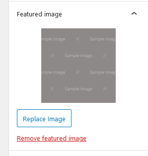
You can customize the header image on individual pages by using the featured image setting in the page properties. This image always scales to fill the full width of the masthead container regardless of how wide the browser window is. It’s never a bad idea to test how this image responds after setting it, and if necessary crop the image and re-upload to make sure it’s displayed as intended. Please note this is a different setting than the Dashboard > Appearance > Customize banner image you set for the home page.
Lightboxes
An additional functionality is included that allows you to create lightboxes for any image you add to a page or post. If you click one of these images, a full-size version of it will pop-up in the same screen. When you click outside of the image (or click the close button) you will return to the normal page. These lightboxes also function as a gallery of all images on the page that have been assigned to be lightboxes.
Adding this functionality to an image is simple. When you add the image, simply attach a link to the image pointing to “Media File” and the rest is done automatically. Try clicking any of the images on this page to see this functionality in action!
Page Flex Content
What is Page Flex Content?
You’ll likely notice there is an additional section labelled Page Flex Content underneath the normal block editor. This allows you to easily create several page elements that are not included in a stock WordPress installation. These Page Flex Content sections are theme specific, and if for whatever reason you change your theme, these items will no longer be visible until you revert the theme back to UW Medicine.
There are two types of Page Flex Content available: Body Elements, and Footer Elements. Body elements appear in the page body, while footer elements appear in the page footer. The items available in Body and Footer elements are different and intended for their respective areas.
How do I add Page Flex Content?
Click either Add Body Element or Add Footer Element depending on which type of flex content area you wish to add to. This will bring up a small context menu, from which you will select the specific type of flex content you want to add. From there, you click Add Row to create instance of that element. These are all repeatable; you can have as many or as few of any flex content elements as necessary.
How does the Page Flex Content work?
Any content added in the page flex content section will always appear on the final page underneath content that is added through the default block editor. This behavior is built into the theme itself and cannot easily be changed. However, you can use the Text Block body element to add normal page content. The one caveat is the text block behaves like the classic editor that came with earlier versions of WordPress instead of the newer block editor.
Don’t panic if you do not know how to create nice looking content with the older text editor. There is a simple work-around:
- Create your content with blocks in the normal block editor above the page flex content section.
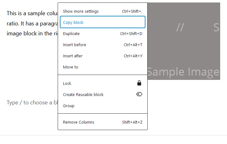
- Click “Select Parent Block” if needed until you get to the top of the block hierarchy. This is situational, if you have nested items you may need to do this, if you only have a single block then you will not.
- Once the block you want is selected, click the three vertical dots to open the options, then select “Copy Block” from the list. The control+c hotkey also works.
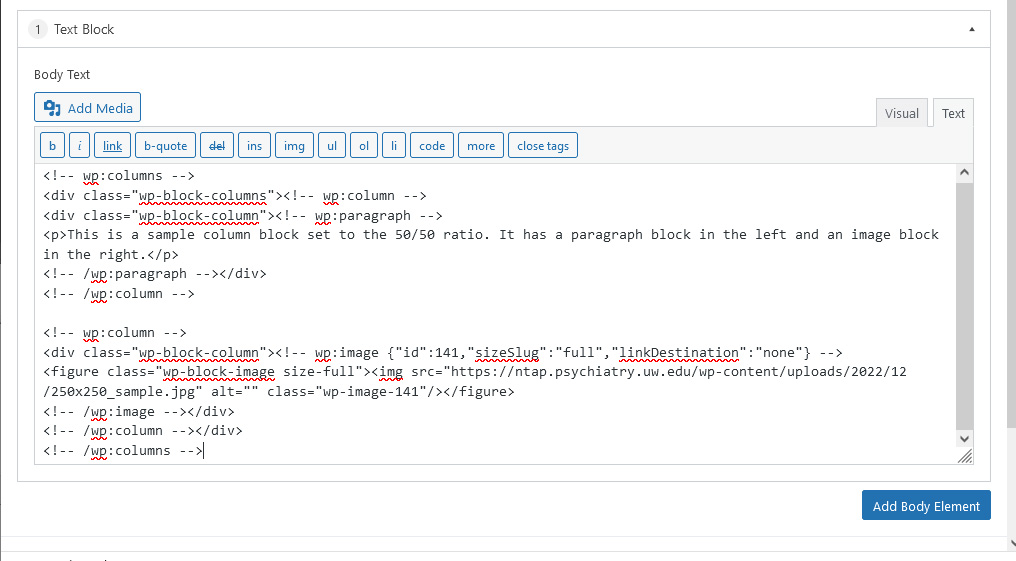
- Go to your text block element in the Page Flex Content area, switch the view from Visual to Text, and paste the copied block. Control+v works here.
- The HTML for the elements designed in the block editor will be pasted into the text block, and will render on the final page just the same as normal.
Accordion Menus
These accordion menus only display a title card by default. When you click on this title card, the accordion will expand to show the contents underneath the title card. The content can be added visually through the Visual tab where what you see is what you get, or it can be manually marked up in the Text tab. The trick above about pasting block-editor created content into the Text tab also applies here.
The code that creates the accordions automatically assigns an id that can be used for anchor links. If you want to link directly to an accordion, simply add a pound sign and the accordion title – in lowercase, without any special characters, and with hyphens replacing spaces. So the “Accordion Title Card 1” below can be linked to with this url: https://perc.psychiatry.uw.edu/sample-parent/theme-info/#accordion-title-card-1
Accordion Body sample. This particular accordion doesn’t contain much, it’s just a visual demo with three rows added.
Accordion Body sample. This particular accordion doesn’t contain much, it’s just a visual demo with three rows added.
Accordion Body sample. This particular accordion doesn’t contain much, it’s just a visual demo with three rows added.
Page Tiles
The Page Tiles allow you to create a row of tile elements with images, text, and links attached. You can choose how many items appear in a Page Tile Group by adding rows similarly to the accordions.
As a side note, this text content was added as a “Text Block” in the Page Flex Content section. The actual content was created in the block editor, then pasted as HTML into the Text tab. Check it out in the editor to see another example of this in action.
Feature Blocks
Below is the footer Feature Block. In addition to what you see here, you can also add a link and/or an embedded video.
Below that is the